Landing Page Redesign
for Flexirent Website

A flexible rental marketplace platform offering short- to mid-term rentals from 1 month to 1 year.
The redesign focuses on clarity, usability, and end-to-end support to create a seamless and trustworthy rental experience.
UX/UI designer
Role
Tool
Figma
Techniques
- Social Media Listening
- Wireframe
Research
Pain Point
The original landing page relied on an excessive use of colors, which resulted in visual noise and made it difficult for users to identify key information and primary actions.
This lack of visual hierarchy caused users to lose focus and reduced the overall clarity of the page.
Additionally, the vibrant and inconsistent color usage weakened the brand’s perceived credibility, making the platform feel less professional and trustworthy.
As a result, the website did not fully reflect Flexirent’s role as a reliable rental marketplace and service provider.
Design Goal
Refine the visual system by reducing color complexity and improving hierarchy, in order to create a more focused user experience and elevate the brand to a more professional and credible standard.
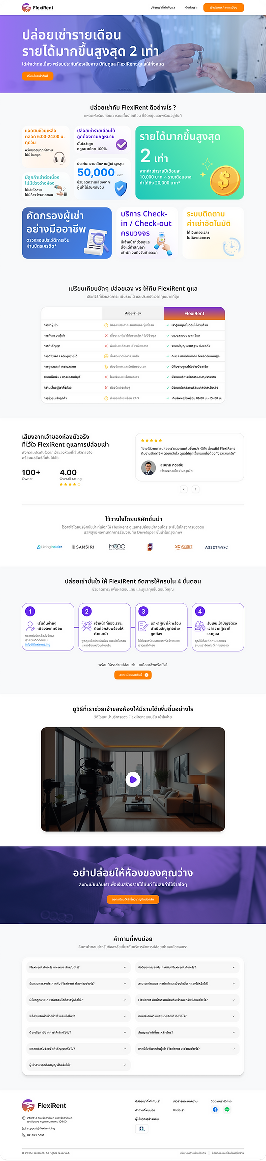
Pain Point 1
The banner uses multiple linear gradient colors that do not align with the brand’s core CI colors.This results in a lack of visual consistency and weakens overall brand recognition.
Pain Point 2
Inconsistent layout, uneven spacing, and lack of pixel-perfect details reduce readability and visual balance.
Mixed icon styles, excessive colors, and text placed too close to the edges weaken brand consistency and professionalism.
Pain Point 3
Mixed icon styles and excessive colors create visual noise, making it difficult for users to focus on key differences.
The table lacks clear visual hierarchy, reducing readability and decision-making efficiency.
After Redesign
After the redesign, visual consistency was improved by unifying icon styles, reducing color usage, and refining spacing.
A clearer visual hierarchy helps users quickly compare information, focus on key differences, and make decisions more efficiently.

Solution 1
Place a video clip at the top of the page to immediately capture user attention and create awareness of Flexirent’s value.
Clearly communicate the key benefits of Flexirent to help users understand how the platform solves their pain points.
Include a strong CTA that allows users to instantly view all available listings and explore rental options with ease.
Solution 2
Select and highlight only the brand’s true key selling points to create clear awareness and avoid user confusion.
Standardize the size of content blocks and use icons with a consistent style and direction to enhance visual consistency and professionalism.
Solution 3
Redesign the comparison table to clearly highlight Flexirent’s advantages.
Apply the brand’s primary color to reinforce brand identity, and use a consistent icon style across all comparison categories to improve clarity, focus, and visual consistency.
Solution 4
As this section represents a registration step flow, the design was refined by using connecting lines between each step from left to right, guiding users to naturally follow the process in sequence.
Headings and descriptions are clearly differentiated through varied typography sizes, with highlight colors applied to key elements to emphasize important information and improve clarity.
Solution 5
Adjust spacing between text and containers, along with refining corner radius values,
to achieve pixel-perfect precision and create a more polished, consistent, and professional user experience.